You’ve settled on your flavours and even possibly produced your batches of E-liquid already. But have you thought about the packaging? Sometimes the design of a product gets left until last resulting in hurriedly designed packaging and labels that can feel subpar in comparison to market leaders. But is it important to make sure your products have the best packaging and design?
Countless studies have shown that packaging has a superior influence on consumers, and can make a difference in acquiring and retaining customers for new products. Are your products receiving the attention they deserve? Here are our top tips for making sure that your product packaging is attractive and brings in the right attention.
Define your target audience
The first and most important step you should think about is your target audience. Who is your product for?
When it comes to vape products and E-Liquids, it’s vitally important to make sure that your products are not targeted at younger audiences. One stigma that refuses to budge for vaping products is the claim that they are targeted toward underage audiences who shouldn’t be vaping. And it is safe to say there are some brands whose designs do lean towards those who are perhaps younger than 18. Making sure your products are not targeted toward younger audiences should be a priority.
Age isn’t just the only type of audience you should cater for; in fact, it can be more to do with the types of people and interests of potential consumers. For example, if you want to cater more towards the sort of vaper who enjoy parties, your design will be very different than if you were targeting vapers who enjoy chic and vintage products. Defining who you want to target will drive your design from the very start.
Using influences from other industries
Researching and referencing existing designs is a common practice by many industries and designers. Taking ideas from existing designs, and improving or tweaking them to create something new, is a great way to create attractive packaging that catches the eye. That’s not to say you should copy other designs, in fact, all this can do is potentially harm your own products which could be unfairly labelled as a lesser comparison. It’s important to understand influence as inspiration and not as a copy and paste. There are a lot of great designs already on the market but there will always be gaps between them that allow for new designs to rise alongside, and even overtake them.
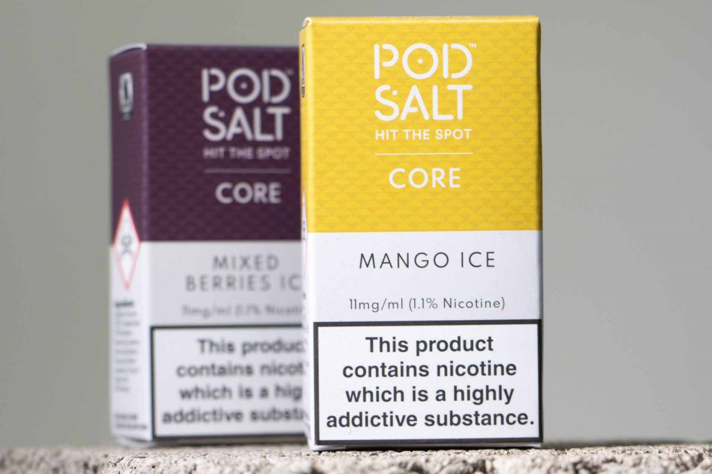
Similarly, the vaping industry has a habit of falling into the stereotypes of ‘vaping design’. By using the same imagery and styles used by other typical vape brands may help your product become more easily recognisable for what it is but doesn’t help it stand out from a crowd. These sorts of designs also run the risk of appearing as child-appealing or cheap looking.
Instead, you can try using influences from other industries to create new, innovative designs for vape products. These could be designs for alcohol, beauty, food, travel and more. Many of these boast designs that don’t necessarily reflect their product literally, but the type of product/meaning consumers pay attention to. Some of the best designs for product packaging and logos are often simple, reflective of the brand and hold meaning.
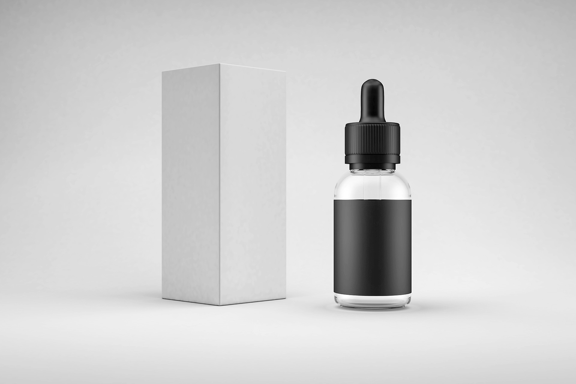
Don’t be afraid to make something simple
Minimalism is a powerful way to make your brand stand apart from the rest. Especially in the vaping industry where designs can easily become overwhelmed with patterns, colours and graphics that swamp a product’s design. These may seem eye-catching but can often be too much to look at or vital information like flavour, brand name etc, can get lost.
With a minimal design it is much easier to single out important information, and especially clean designs that highlight a single focus, are much more eye-catching and can create a natural curiosity with a consumer. It should be enough to note that popular brands in a variety of industries are all looking at ways to make their logos more minimal. See for example the changes in designs from Amazon, Facebook, Starbucks, and Pringles to name a few.
Although many of these have stemmed from their brand awareness peaking, allowing them to simplify their designs, many are also aware that simple and minimal designs are much more digestible and memorable for consumers. A good practice would be to show someone your logo design and if, after a short period of time, they are able to recall your design quite clearly or at least the keynotes of it, then it’s a good logo design.
This also stems from the product labels and packaging. Overwhelming the vital product information with in-your-face graphics, patterns and colours can be a turn-off for many consumers. Your core product message can also get lost amid the graphical chaos. Simplicity doesn’t have to mean adding a logo and product information to a white background and calling it there (although this could be quite effective depending on the branding and logo). It means choosing what you want customers to know about your product and the first thing you want them to see that would draw them to your product.
Function vs form
It’s very important to understand the form and function of your product when designing packaging and labels. The form stands for the overall look and feel of the design from its font, graphical elements, texture and colour. The function is the practical element of the design that suits the purpose of the product. Form without function is merely pretty packaging, and function without form can’t achieve its goal. Establishing the purpose of your product, whether it be to offer impressive flavours, help smokers quit, or work best for sub-ohm vaping, will help lead your product designs form.
Considering finishing from the outset (what finishes you want)
Naturally most think of finishes as being the tail-end of the design process but in actual fact, it’s worth deciding on the finish of your product packaging from the beginning. Deciding on this can impact the actual design of your packaging and can make the finish feel more organic, rather than some fancy foiling tacked on at the end.
Exploring new finishes is also a great way of helping make your product stand out from the crowd. There is a wide variety of finishes from glossy to matt lamination, to soft-touch, textured and metalised foil, to UV varnish and even unique ones such as glow-in-the-dark lacquer ad thermal lacquer. Some of these may not suit the product type but introducing something different and unique looks more interesting than simple silver or gold foil.
Listen to your designers
Probably the most important aspect of the design process is to listen to your designers. Often it can be easy to have a picture in mind of how you think it should look, but rarely does the images in our mind translate well to reality. Designers are tasked with this venture and use their experience and expertise to try and translate your ideas to reality. Sometimes this may not match exactly with your original concept, but more than often these changes are purposeful. Make sure to communicate with your designers and listen to their reasoning behind the changes. The answers may surprise you!
Hopefully, this provides you with some food for thought on your next product launch, or perhaps if you’re thinking of refreshing your current product offers with new artwork. Whatever it is, Xyfil can help with our dedicated Studio team who have years of experience in helping brands develop their logos, labelling and packaging. Many award-winning brands have benefitted from our expertise, and you can too. Contact us to find out how we can help you.